10 Landing Page Patterns Behind Long-Running DTC Ads
We captured 64 landing pages behind DTC brands' running Meta ads. These 10 patterns kept showing up, with the research behind each one.
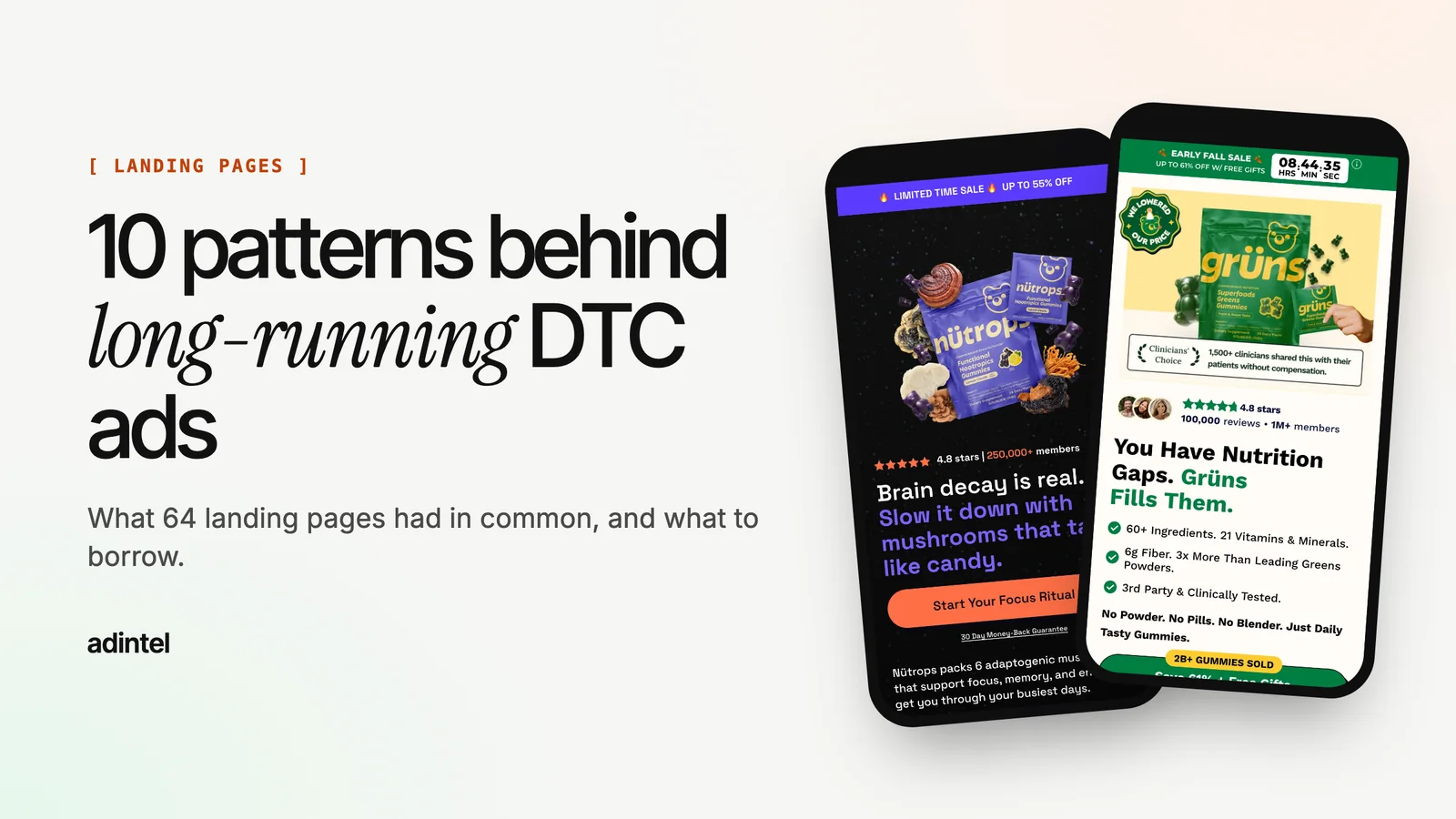
A good ad gets the click. The landing page decides whether that click turns into an order. So when a competitor keeps an ad running for months, the page behind it is worth studying almost as closely as the ad.
In October 2026 we captured 64 landing pages that DTC brands, mostly in supplements, skincare and pet health, were sending their Meta ad traffic to. We took full-page screenshots on a phone and a desktop and read each page top to bottom. We can't see these brands' conversion rates, so this isn't a ranking. These are the patterns that kept showing up on pages behind ads that stayed live, plus what independent research says about each one.
First, a benchmark so you know what "good" means. Unbounce's 2024 Conversion Benchmark Report (41,000 landing pages) puts the median landing page conversion rate at 6.6% across industries and 4.2% for ecommerce. Note that this counts any conversion on the page, so don't compare it with your Shopify session-to-order rate, which measures something else. The same report found that about 83% of landing page visits come from phones. Every pattern below matters most on a phone.
1. The offer is in the first screen
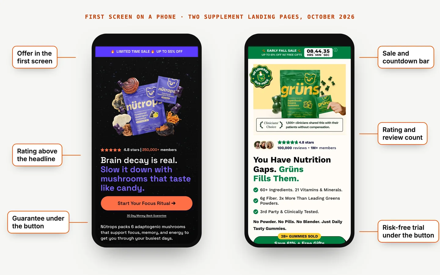
On page after page, the deal was visible without scrolling: "BOGO" in the headline, a sale bar reading "Up to 55% off", or a price with the strike-through right under the hero image. Offer-led pages didn't make paid social visitors hunt for the reason to buy now.
Why it matters: in Nielsen Norman Group's eye-tracking research, people spent 57% of their viewing time above the fold, and 74% in the first two screenfuls. Whatever you most need people to know has to live there.
Borrow it: if your ad leads with an offer, your landing page's first screen should repeat that exact offer, in the same words.
2. Proof sits above the headline, not at the bottom
The strongest pages put a star rating and a review or customer count before the headline: "4.8 stars | 250,000+ members", "4.7 | 50,000+ pet parents", a row of customer photos next to the rating. Proof came first, then the promise.
Research backs this up. Northwestern's Spiegel Research Center found that a product with five reviews is 270% more likely to be bought than one with none, and that purchase likelihood peaks at an average rating of 4.0 to 4.7 stars, then dips as ratings approach a perfect 5.0. Shoppers trust a few honest flaws.
Borrow it: put your rating and review count in the hero. If your average is 4.6, that's an asset, not a problem.
3. Cold traffic gets a pre-sell page
Several brands sent ads to an advertorial or a listicle instead of a product page: "5 reasons why...", a story headline with a byline and a reading time, sometimes labelled "Advertorial". These pages explain the problem before they sell anything. On one, the first button didn't appear until roughly 11,600 pixels down the page.
This fits buyer awareness. Someone who has never heard of your product needs a reason to care before a buy box makes sense. Someone who already knows you just wants the price. Published results for pre-sell pages come mostly from agencies and founders, so treat the big numbers you see online as anecdotes. The pattern itself is everywhere in long-running supplement ads.
Borrow it: if your ads target new audiences with a problem-led hook, test a listicle or advertorial between the ad and the product page.
4. Quizzes for "which one is right for me?" products
When the right product depends on the buyer (skin type, hair concern, life stage), brands used quizzes. SpoiledChild's ads opened straight into step one of a quiz ("How does your skin feel?") with a progress bar and a "less than 90 seconds" promise. Nutrafol kept a "Take the Quiz" button in the header of every page we captured.
Borrow it: if customers often ask you which product to choose, a short quiz can answer that and capture an email at the same time.
5. One page per angle
Some brands built several near-identical pages that differed only in the headline: one written for one symptom, another for a different one, each matched to the ads that used that angle. Nutrafol ran separate pages for specific audiences, for example people on GLP-1 medication and women going through menopause.
This is message match. Nielsen Norman Group calls it information scent: people judge whether a page will meet their need from the cue that brought them there. If the ad talks about one problem and the page opens on another, the scent breaks and the visitor leaves.
Borrow it: when an ad angle starts to win, give it its own headline on its own page. Changing only the hero copy is a cheap test.
6. The guarantee sits next to the button
Risk reversal showed up right where the decision happens: "365-day money-back guarantee" as a badge in the hero, "Results in 6 months or your money back", and on one page, guarantee wording printed inside the button itself ("Try it today / 60-day money-back guarantee").
Honest caveat: we found no rigorous public study measuring how much a guarantee lifts conversion, and anecdotes go both ways. But Baymard Institute's checkout research finds that 13% of shoppers who abandon a purchase cite an unsatisfactory returns policy. Removing that doubt at the button is a reasonable test.
Borrow it: if you offer a guarantee, say it in a few words directly under or inside your main button, not only in the footer.
7. The price is reframed and subscribing is the obvious choice
Price-per-day framing was common: "$1.25/day" and "about $1.07 a day" instead of a monthly total. Buy boxes often put subscribe-and-save next to one-time purchase, with ticks against the subscription and crosses or "no free shipping" against one-time, so the subscription looks like the clear choice.
Independent data on subscribe-and-save conversion is thin; most published numbers come from app vendors. The pattern is still worth testing if lifetime value matters to you more than first-order revenue.
Borrow it: show the daily price next to the full price, and make the difference between one-time and subscription obvious at a glance.
8. The discount comes with the click
One pet brand's ad linked to a URL that applied the discount code automatically (a /discount/ path in the link), so the visitor never had to find or type it. Baymard's research shows why that helps: unexpected extra costs are the most common reason shoppers abandon checkout, cited by 40% of people who leave.
Borrow it: if an ad promises a discount, put the code in the link so the price at checkout matches the ad.
9. Third-party credibility near the top
Clinician-endorsement widgets appeared on several supplement pages, showing how many clinicians recommend the product, along with press logos and "#1 recommended" claims with a footnote to the source.
If you use these, follow the rules. The FTC's Health Products Compliance Guidance (December 2022) says health claims need competent and reliable scientific evidence, endorsers' material connections must be disclosed, and testimonials showing atypical results can mislead even with a "results not typical" note. This is a summary, not legal advice; check the guidance itself.
Borrow it: use credibility you can document, and put it near the first button.
10. A fast, clear first screen with no popup in the way
The pages that read best on a phone loaded quickly and showed the product and offer straight away. Several we captured fired an email or discount popup the moment the page opened, covering the hero before the visitor had read a word.
Speed matters too. Portent's 2022 study of about 100 million page views found ecommerce conversion rates of 3.05% for pages that loaded in 1 second, against 1.68% at 2 seconds and 1.12% at 3 seconds.
Borrow it: delay your popup until someone has scrolled or spent a few seconds on the page, and check your landing page speed on a real phone.
What to avoid: mistakes we saw more than once
- Countdown timers that reset. Reload the page and the "sale ends in 2:00:01" clock starts again. Visitors notice, and it costs trust.
- Discounts stacked past believability. "Up to 95% off" plus a code plus a subscription discount reads like a pricing problem, not a deal.
- Seasonal copy left running. "Summer-ready" copy on a page receiving traffic in late October.
- Reviews sorted newest first. One page showed its 1-star reviews first, below an otherwise strong hero.
- Sending paid traffic to a homepage or a marketplace listing. You lose control of the message, and on a marketplace listing your competitors' ads sit right next to your product.
- Slow tracking redirects. Extra hops between the ad and the page add load time on a phone.
A quick checklist for your own page
| Check | Done? |
|---|---|
| The ad's offer is repeated in the first screen, in the same words | |
| Rating and review count appear above or beside the headline | |
| The headline matches the ad's angle | |
| The main button is in the first screen and repeats down a long page | |
| Guarantee or risk reversal sits next to the button | |
| Price shown per day or per serving where it helps | |
| The discount from the ad applies automatically | |
| No popup covers the first screen on load | |
| The page loads in under 3 seconds on a phone | |
| Health claims and endorsements can be backed up |
How to study competitors' landing pages
Click a competitor's ad in the Meta Ad Library and you'll see their landing page, as it looks today, on your device. To learn from it properly you want the full page on both phone and desktop, a record of how it changes over time, and a way to compare two pages side by side.
adintel does this automatically for every ad in its library. It captures each landing page in full on desktop and phone, with popups cleared. It reads the headline, offer, price and button text, and on request it analyses the page's framework, offer mechanics, strengths and weaknesses, with a score. You can also put two pages side by side. There is a 7-day free trial.
FAQ
What is a good conversion rate for a DTC landing page?
Unbounce's 2024 benchmark puts the ecommerce landing page median at 4.2% and the all-industry median at 6.6%. Those count any conversion on the page. Store-wide Shopify conversion rates, measured as sessions to orders, are much lower, so compare like with like.
Should Facebook ads go to a product page or a landing page?
It depends on how well the visitor knows you. Warm audiences and offer-led ads often do well on a focused product page. Cold audiences reached with a problem-led hook often need a pre-sell page (a listicle, advertorial or quiz) first. Test both with the same ad.
How long should a landing page be?
Long enough to answer the visitor's objections, with the essentials in the first screen. Expensive or unfamiliar products usually need more explaining; simple, cheap or well-known ones need less. Our longest pages repeated the main button after every section, so a ready buyer never had to scroll back up.
How many calls to action should a landing page have?
We found no solid public study on this. In practice, long-running pages used one main action and repeated it, for example the same button after each benefit section, rather than several competing actions.
Sources: Unbounce Conversion Benchmark Report and its ecommerce page; Nielsen Norman Group on scrolling and attention and information scent; Spiegel Research Center, How Online Reviews Influence Sales; Baymard Institute cart abandonment research; Portent, site speed and conversion; FTC Health Products Compliance Guidance.